
Le Misplaced Frenchman

THE CHALLENGE
Create a unique and memorable brand identity and bottle design for an up-and-coming Okanagan winery that sets itself apart from the rest of the wineries in the region.
THE OUTCOME
A brand name and logo that tells a unique story about the winemaker. A series of wine bottle designs that visually compliment each other while standing out from the rest of the Okanagan competition, classic but with a twist.
SCOPE
Brand Identity, Compeptive Audit, Logo Design, Wine Bottle Packaging (series)

BRAND NAME
The challenge when coming up with a suitable name for this new winery was that simply creating a memorable name was not good enough, it was also important to create a name the winemaker, Claude Dubois, could take ownership of. To achieve this, I took inspiration from Claude's life journey, here was a prideful Frenchman who moved to Okanagan, BC to fulfill his dream of owning his own winery. "Le Misplaced Frenchman" is a brand name that captures the essence of Claude's journey while also being unique and quirky to stand out from other wine brands.


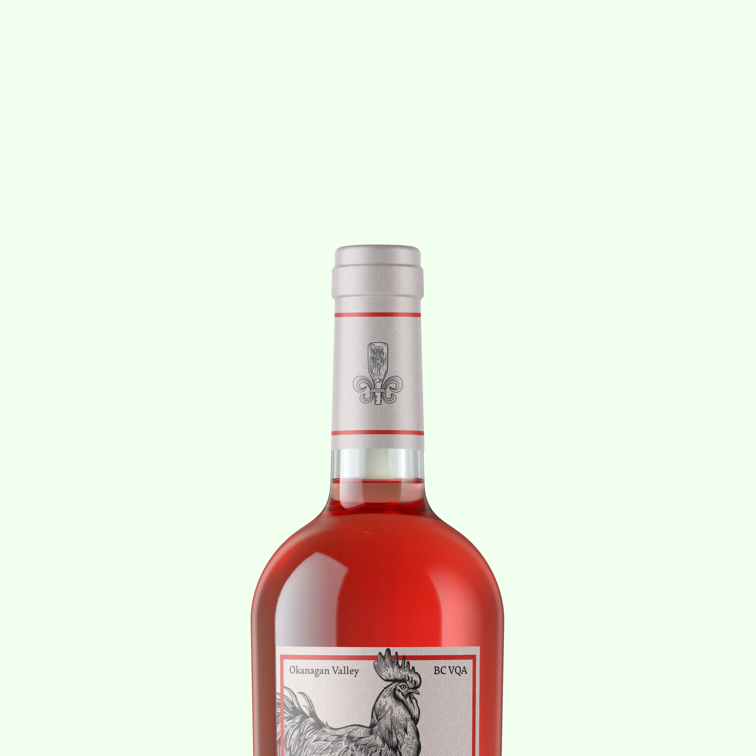
logo
The primary logo brings a modern "wine" twist to the classic French Fleur-de-lis. The logo was produced in an illustrative style, matching the illustrations in the label design.
label design
The design goal when producing the bottle label was to not only create a visually appealing design but also continue to tell the brand story though symbolism. At the top of the design stands a prideful Gallic rooster, a national symbol of France while at the bottom sits a beaver representing Canada, Claude's newfound home.
Typography
Legibility, information hierarchy and legal size requirements were all factors that went into the typography design of this label. Seven key pieces of information were incorporated into the design and placed in accordance to importance to the customer while also maintaining a balance of visual spacing. The brand name is displayed in Charcuterie, a typeface inspired by classical french calligraphy while the accompanying text uses Garibaldi as a typeface.